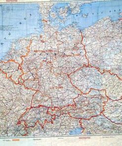
Original British WWII Royal Air Force and Ground Forces Map Lot – 6 Maps Original Items
$ 195,00 $ 78,00
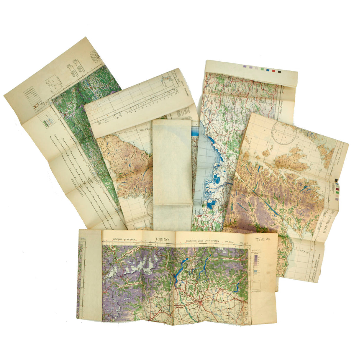
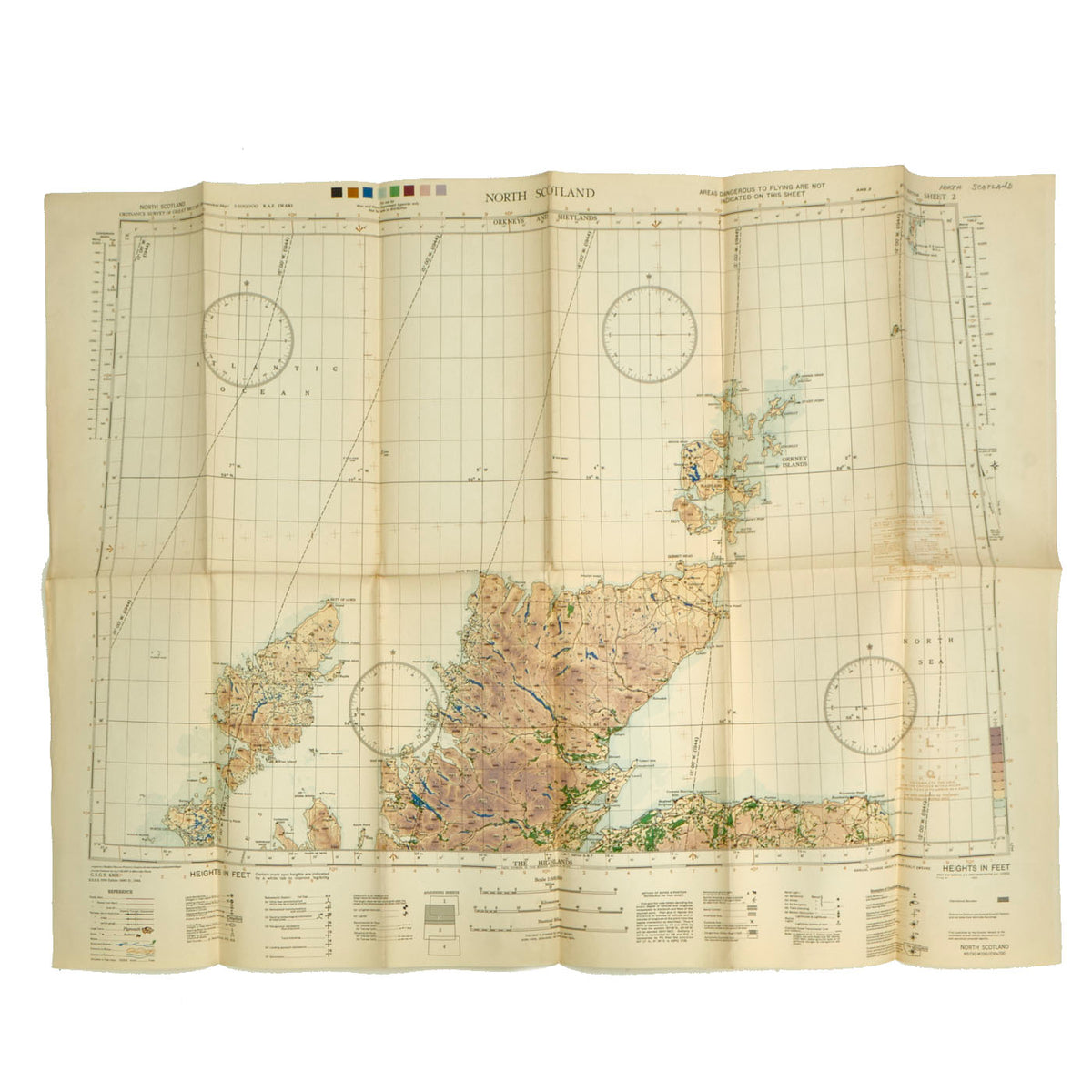
Original Items: Only One Lot of 6 Available. For operations which demanded co-operation between both ground and air forces, it was essential that both branches of the military use the same map. This helped facilitate planning, briefing, and inter-communication, as well as ensuring a common basis for referencing map coordinates. Maps used for such operations, therefore, had to meet the needs of all parties involved.
The Royal Air Force (R.A.F.) employed amber lighting in the cockpit area of their planes when flying after dark, to minimize the loss of the flight crew’s night-vision, thus allowing them to see both the instrument panel and objects through the window simultaneously. The colors on the maps, therefore, had to be selected so as to be visible under these special lighting conditions. During operations, air crews were also forced to use their maps in cramped and unstable conditions subject to intense vibration, so legibility and clarity were of great importance.
Ground forces, on the other hand, required more topographical detail than was present on the typical navigation chart used by the R.A.F.
Distinguishing Features of an “Army/Air” Map
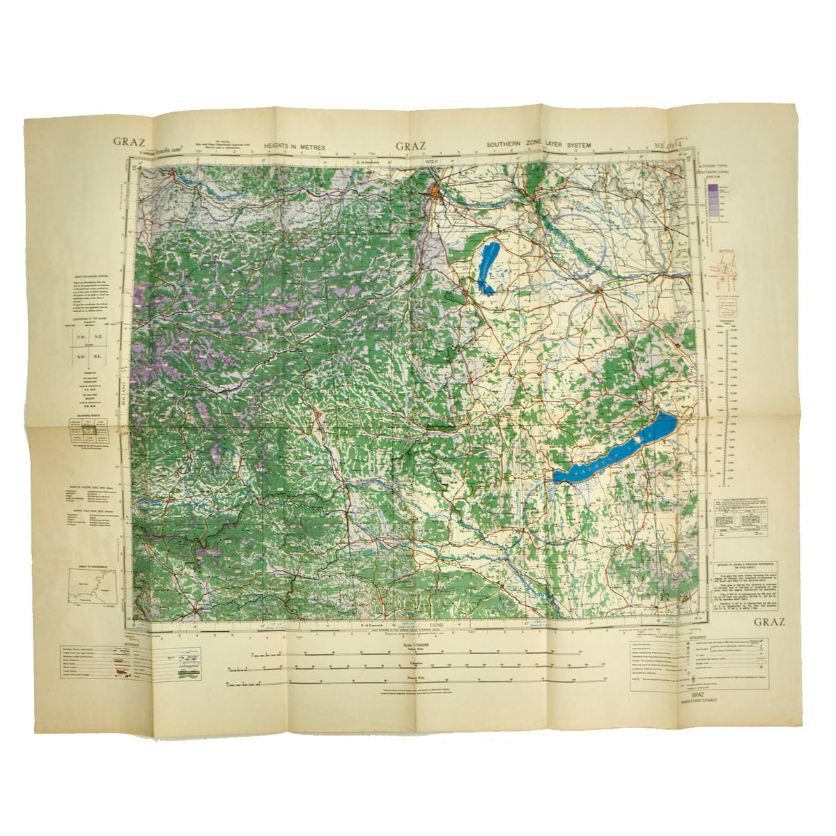
The scale of the map had to be large enough to show a sufficient amount of detail for the ground forces, while remaining small enough to show as much geographic area coverage as possible for the air forces–typically 1:250,000 (1 cm = 2.5 km).
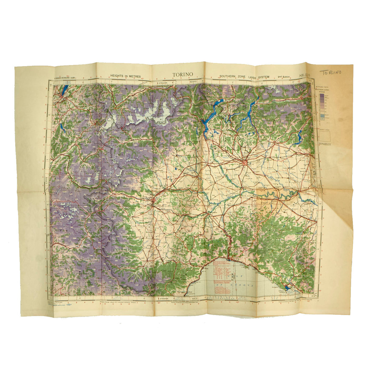
The road color was selected so that, under the amber light, it would neither fade out and disappear, nor become so dark that it would be confused with railways. The object was to cause the main roads to appear as an apparent sepia color.
Coastlines were made to be more visible under the amber lighting conditions by applying a blue “verge” to highlight the transition from water to land. Rivers were also slightly thickened for emphasis as they were important aids to navigation.
Forests and Wooded areas were printed in a brilliant green, as–like water features–they were also important aids to navigation. Their distinctive shapes, as seen from the air, could often be used to identify them.
Hypsometric layers, representing increasing levels of elevation, were printed in graduated tints of violet. Selected critical spot-heights were shown on ridges and summits which constituted dangers to flying in fog or darkness. Where necessary, these spot-heights were printed inside a white “text box” in order to stand out clearly against the violet-coloured mountain background.
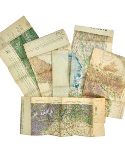
The Maps Featured In This Lot:
– 1944 Unlabeled Map of the British Coastline (28 ½” x 23”): The map is in good condition with lovely detail. It is unlabeled for a location at the top but it appears to be the south eastern part of England with towns and camps labeled from Cambridge to Kent up to Norfolk.
– 1944 Air Map of Marseilles (34” x 25”)
– 1944 RAF Map of The Highlands (37 ½” x 28”): This example is labeled as an RAF Aeronautical map for the Scottish Highlands. The map appears to have been printed by the US Army in Washington DC.
– 1941 Air Map of Torino (34 ½ x 24 ½)
– 1944 RAF Map of North Scotland (38” x 28”): The map was printed by the US Army in Washington DC.
– 1942 Air Map of Graz, Austria (35 ½” x 28”): The map was printed by the US Army in Washington DC.
All maps are in good, legible condition with all colors and markings still very clear. All come ready to be displayed!
Fast Shipping with Professional Packaging
Thanks to our longstanding association with UPS FedEx DHL, and other major international carriers, we are able to provide a range of shipping options. Our warehouse staff is expertly trained and will wrap your products according to our exact and precise specifications. Prior to shipping, your goods will be thoroughly examined and securely secured. We ship to thousands clients each day across multiple countries. This shows how we're dedicated to be the largest retailer on the internet. Warehouses and distribution centres can be located throughout Europe as well as the USA.
Note: Orders with more than one item will be assigned a processing date depending on the item.
Before shipping before shipping, we'll conduct a thorough inspection of the items you have ordered. Today, the majority of orders will be delivered within 48 hours. The delivery time will be between 3-7 days.
Returns
The stock is dynamic and we cannot completely manage it because multiple stakeholders are involved, including our factory and warehouse. So the actual stock may alter at any time. It's possible that you may not receive your order once the order has been made.
Our policy is valid for a period of 30 days. If you don't receive the product within 30 days, we are not able to issue a refund or an exchange.
You can only return an item if it is unused and in the same state as the day you received it. You must have the item in its original packaging.
Related products
Uncategorized
Uncategorized
Uncategorized
Uncategorized
Australian WWII Owen MK1 Machine Carbine SMG Custom Fabricated Replica with Sling Original Items
Uncategorized
Armoured Fighting Vehicles of the World: AFVs of World War One (Hardcover Book) New Made Items
Uncategorized
Uncategorized
Band of Brothers ORIGINAL GERMAN WWII Le. F.H. 18 10.5cm ARTILLERY PIECE Original Items
Uncategorized
Uncategorized
Angolan Rebel 1970s era 60mm Inert Display Mortar from Angolan Civil War Original Items
Uncategorized
Uncategorized
Armored Burgonet Helmet & Polearm from Scottish Castle Leith Hall Circa 1700 Original Items
Uncategorized
Uncategorized
Uncategorized
Uncategorized
Uncategorized
Uncategorized
Uncategorized
Uncategorized
